


The forms of the letters are not objects of affection for anyone other than us designers. Even so, not all designers hold them in deep esteem. For those of us who find letters fascinating, their shape are captivating, seductive even. Once upon a time letters were exclusively crafted by hand, with a stylus on clay, a reed and ink on paper, and later illuminated calligraphy on paper like material. The printing press came along and typefaces were born. And while the press opened the door for typeface design, it was not until recently that typeface design as a field exploded into what it is today.
We can discuss the dip letter making and drawing made by hand took after the computer and the printer became a household item. Or how the advent of the internet and its ubiquitous presence in our everyday lives pushes for a neutral look in letters. Jaguar’s new logo, anyone? I believe the neutral looking letters in their logo have a certain beauty to them. I know there has been much controversy around their new logo lately. I miss the little jaguar too but I can’t say that their new typographic signature isn’t beautiful.
I have loved letters long before I knew there were fields dedicated to study them. At one point, I did not even know what calligraphy was. All I knew was that cursive writing was something I really enjoyed. So much so, I developed three different handwriting styles for my notebooks. Those punishments that teachers gave in grammar school to write something a 100 times? For me, that was heaven! Give me more! Many times I would buy new notebooks just to write it all again and have a pretty notebook. In college I learned from a classmate named Stella, to write like an architect in geometrically shaped letters. So, I guess I added a fourth writing style to my assortment and also discovered calligraphy.
Three fields overlap each other with a focus on letters: typography or typeface design, calligraphy, and lettering. Each of their processes and outcomes might have a different feel and look but, most often they share the same starting point: the pencil. Frequently each letter shape, eccentric or traditional, start with a humble sketch or doodle exploring the framework and skeleton of the letter.
The letter’s framework has become much more of an interest to me lately. In my daily practice journey, I have acquainted myself with several styles of lettering and calligraphy. Though there are so many styles and alphabets to learn, the letters’ basic framework remains the cornerstone of each. The basics are: square, circle, and a triangle. But it is not as simple as that either. There are nuances in the formation of each letter. Some letters will occupy the entire square but others will not. This framework is based on Roman Capitals as they are considered by many calligraphers and typographers the foundational structures. The book The Art and Craft of Hand Lettering by Annie Cicale shows a useful tool to relate to when forming letters.
Photo below from Annie Cicale’s book The Art and Craft of Hand Lettering.
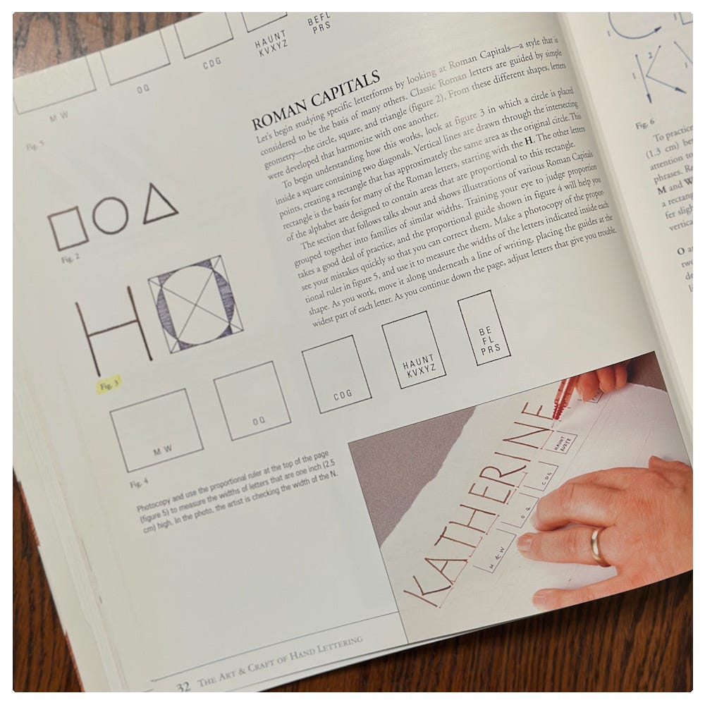
It is a simple ruler to help in ensuring the letters look uniform though they are not necessarily mathematically exact. There is a funny effect that takes place if say, an E occupied the entire square. The length of its horizontal strokes would make the E look imbalanced even if mathematically correct and objectively symmetrical.
Drawing letters for calligraphers is different than what we commonly think drawing letters is. When I think of lettering, there are so many styles that come to mind, but one in particular is illustrative lettering. Letters which are composed digitally can be become elaborate and very ornamented, in almost fantasy type of look. I have been studying letter drawing with Jurgen Vercaemst through the site The Gentlepenman. The way he draws his letters is stroke by stroke, with a .03 mechanical pencil, very slowly. I am both fascinated and mystified. Even when I think I am going slow, he sees I am not. His work is something I admire and his mastery is exemplary.
My practice has turned its attention to this style of lettering with only pencils. In this change of focus I have been able to see how much one tends to rely on bells and whistles to create impact instead of creating the impact stroke by stroke for letter formation. Yes, it takes a while. Partly, that is the point. Understanding the formation of the letters within their foundational structure and building it, just like a craftsman would build with excellent craftsmanship a structure. It is humbling, tiring, and there is a moment that one gets antsy to finish. Once the eye becomes accustomed to the details, the change of pace becomes obvious in the strokes.
Below are some shots of my practice. I have much to learn.


These practice sheets are all so fun to see. Loved the Tolkien example!