
Sexy 5…
An essay…

My hubby, Tyson, asked me today what was my favorite number. We were playing Rummy and after playing together for so many years, we both have our tells. I jokingly said, “here is your 2 for your favorite 2s.” Likewise after he put down a 10, he says “here is your favorite too.” I said, yes, I actually like the number 10. At that point, he asked the question.
If you ask a typographer or a graphic designer which is their favorite letter or number, you will get another question. Which is exactly what I did. When he asked which one was my favorite number, my answer was, “Well, in what sense? Typographically? Or symbolically?’ He said typographically first.
I had not thought about my favorite number before. I listed several. Then, I realized that my favorite number was 5 followed by the numbers 4 and 3. There are numbers that well, not much can be done with them design wise. I mean, how many ways can one design the number 1? One can always design the zero to be taller, wider, italic, or straight. Though the number 1 can be either italic or straight, the most one can do is design a serif, which granted, can have flair. Or the number 1 can be thick or thin. Outside of that, there is not much more to imbue the number 1 with personality.
The number 5 however, unifies the sharp geometry of right angles and the sensuous curve of the bowl. Further, the bowl can descend deeper or rest on the baseline (the imaginary line on which the letters and numbers rest) depending on its style. The style can be “lining”, which means they sit on the baseline or it can be “old style” or “non lining”, which means they descend the baseline. Within that however, the range is varied. Take a look at the quick graphic I put together with some fives. The red line is the baseline.
Look at the luscious and juicy sense of presence on that first five! Most of the fives are delicate yet, there are significant differences, from the curved flag (the horizontal top line) to the way the bowl curves to the left side leading the eye back up to the flag. Or the way the curve can be open almost as if the person did not bother to finish the entire curve when writing.
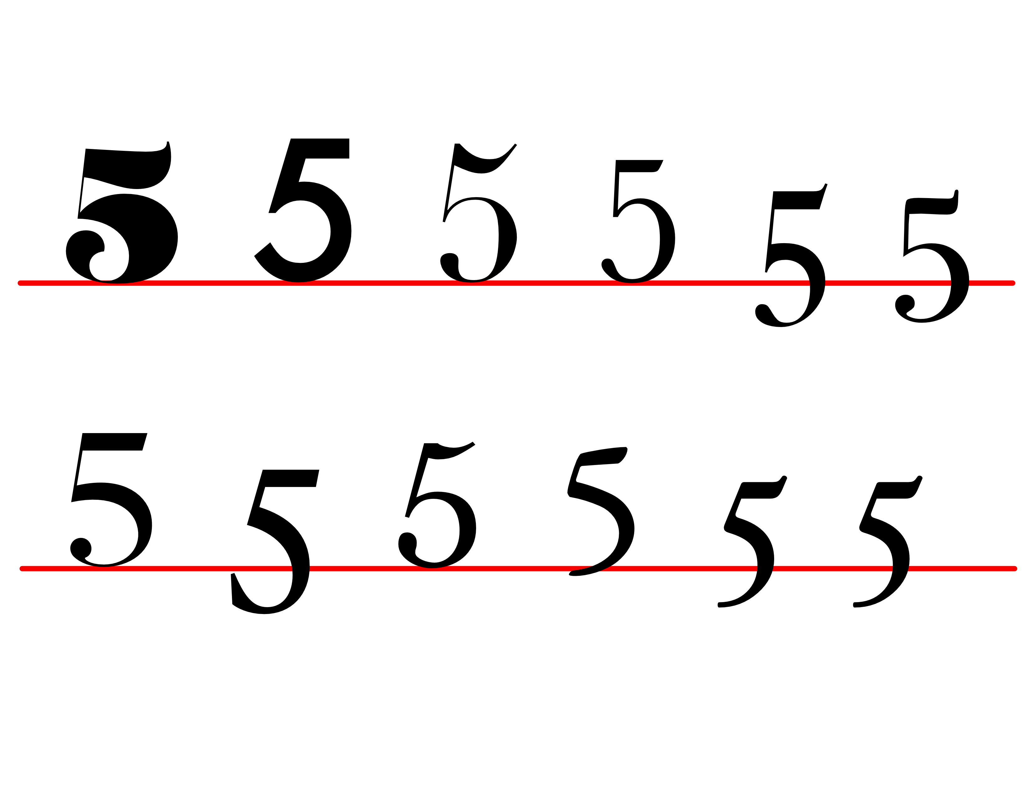
© Alma Hoffmann. 2026. Number 5 diagram.
Yes, the variations are significant. No, I did not type out the name of each typeface because I wanted you to focus on the shapes instead of reading the name of each typeface. One can’t help but want to read if it is there and with that, the focus on the shape is gone.
Stripping the mind from the letters’ and numbers‘ symbolic meaning takes a bit of time and training. Yet, it is one of the most basic lessons we, designers, have to learn: unlearn the symbolic meaning of letters and numbers to focus on the shapes. It is not easy, right? Yet, it is crucial for us designers.
Maybe this week, pay some attention to the letters and numbers that come your way. Look at the details that you might dismiss otherwise. What do you see? And yes, let me know what you find!
Until next week.
Love,
Alma