
Miso…what?
An essay…

© Alma Hoffmann, 2025
Sometimes I volunteer to participate in studies either sponsored by the university I work at or from others. Last Friday I participated in a study about sound. Specifically, a study about sound sensitivity, which is called misophonia. It is not a new condition but not much is known about it until fairly recently. The professor conducting the study is Dr. Mary Schadegg.
The study is administered by one the graduate students who works with Dr. Schadegg. She was (I don’t remember her name, sorry!) professional, a good listener, and quick on her feet. Whenever there seemed to be a slight discrepancy between recent answers to previous ones, she’d remember and asked me again. That impressed me.
It was a three hour study that involved interview questions about my life, my background, preferences, responses, and so much more. I learned a lot during the study since when one is going through questions and answers, self reflection happens almost by default.
In simple terms, misophonia is a strong and adverse reaction to human sounds. These sounds can be coughing, tapping, clearing one’s throat, chewing, snoring, and so on. The sounds can be interpreted in the brain (thanks to a recent imagining of the brain) as threatening causing strong emotional and/or physical reactions. I had never heard of the condition before I saw the announcement for the study through our campus email. The email asked if one is affected, bothered, angered, upset, altered emotionally or physically when certain sounds occur. I saw myself in the questions and thought, this might be fun. So, I signed up.
The study does not offer a diagnose. They are simply collecting data. Which was very interesting to me. As a designer, I also wanted to see how they administer these types of tests, the written materials, the environment, and the interface. One of the challenges of being a designer is that one can’t choose not to be a designer. In other words, I am always analyzing how everything I interact with can be better.
Don’t get me wrong, I loved the experience. I learned that I should get tested for misophonia. During the study, I discovered that my reactions to certain sounds are incredibly visceral. One of my family members can’t be in a room that is super loud. I also understood why I tend to avoid certain situations and circumstances. It is a mechanism I have adopted to manage my strong reactions to certain sounds.
BUT (please imagine the word in larger capital letters, bold, and red as I do not have those options here), the materials, the environment, and the interface needed help. I vacillated in my mind thinking “Am I responding to this stimulus because of what it looks like or because of the sound as a trigger?”
The documents were pretty standard probably typed by a non designer. Nothing particular about them. I will concede that in this context, that might be what was needed. Before certain triggers were presented, a set of sheets were provided with a bar to be considered a thermometer. Each sheet asked to respond to a question at the top. After the triggers were presented, another set of sheets were provided with the same parameters but the order of the sheets changed. Each sheet was black and white, a certain number of questions, average type size, blanks to fill in, and so on. The back and forth of filling out these sheets annoyed me a little bit. I started to get anxious. I kept wondering, why are these not on the same interface I have to interact with? They could be in the program, I fill them out, triggers are paraded, and once done, the questions pop up again?
The room we were in, had no windows. Perhaps this is necessary. I am not sure. Walking to the study room felt akin to walking through US Customs’ back rooms when arriving from an international flight; cold, sterile, and harsh. I sat on a couch and my interviewer sat on a chair in front of me. Let me say again that she was very nice and charming. There were no pictures of anything anywhere. Even the color of the couch was uninviting. The sound booth was all padded and at one point, I thought, “Hmmmm… will I come out of this?” Something to know about me is that my sense of humor is wicked.
The interface was perhaps the most objectionable of all the elements I observed. I had to look at a series of video clips and rate them (as I explained earlier a set of sheets with questions are provided before and after). The videos were poorly cropped, pixelated, blurry, and seemed rather outdated. The videos never changed. They were repeatedly used to assess my reactions in different order and sequence. I did wonder, if these visual materials were the best they could find? It was hard for me to look past the visual problems these videos presented. These problems became a distraction that I could not ignore.
I can’t determine if the study will be affected by the issues I just mentioned. They affected me. My hubby said the visual issues affected me because I am a designer and I notice. Yes, that is true. I am a designer and I know how to design things to facilitate, to engage, and yet function.
A lot of my students have heard my theory. I believe that the brain is such an eloquent and high functional organ that it bypasses any bumps to make sense of what it is engaging with. So, the fact that I was able to do the study and keep my design protests at bay, only means that thankfully, my brain works. It is doing its job. BUT (and again, imagine this word in larger capitals, bold, and red) that does not mean the materials should not be better designed and visually presented. On the contrary, in order to help the user or the reader engage with the content for its data or stimulus, then, let’s design the materials in a way that in the words of Beatrice Ward in The Crystal Goblet, should be invisible. Warde proposes that typography is a medium, which similar to a wine goblet should be transparent so that the wine could be examined. Here is quote from her famous essay:
You have two goblets before you. One is of solid gold, wrought in the most exquisite patterns. The other is of crystal-clear glass, thin as a bubble, and as transparent. Pour and drink; and according to your choice of goblet, I shall know whether or not you are a connoisseur of wine. For if you have no feelings about wine one way or the other, you will want the sensation of drinking the stuff out of a vessel that may have cost thousands of pounds; but if you are a member of that vanishing tribe, the amateurs of fine vintages, you will choose the crystal, because everything about it is calculated to reveal rather than hide the beautiful thing which it was meant to contain.
In the context of a study, not only the typography should be invisible and strictly functional (and functional should be elegant and sophisticated), other visual materials should also be void of any fingerprints or smudges.
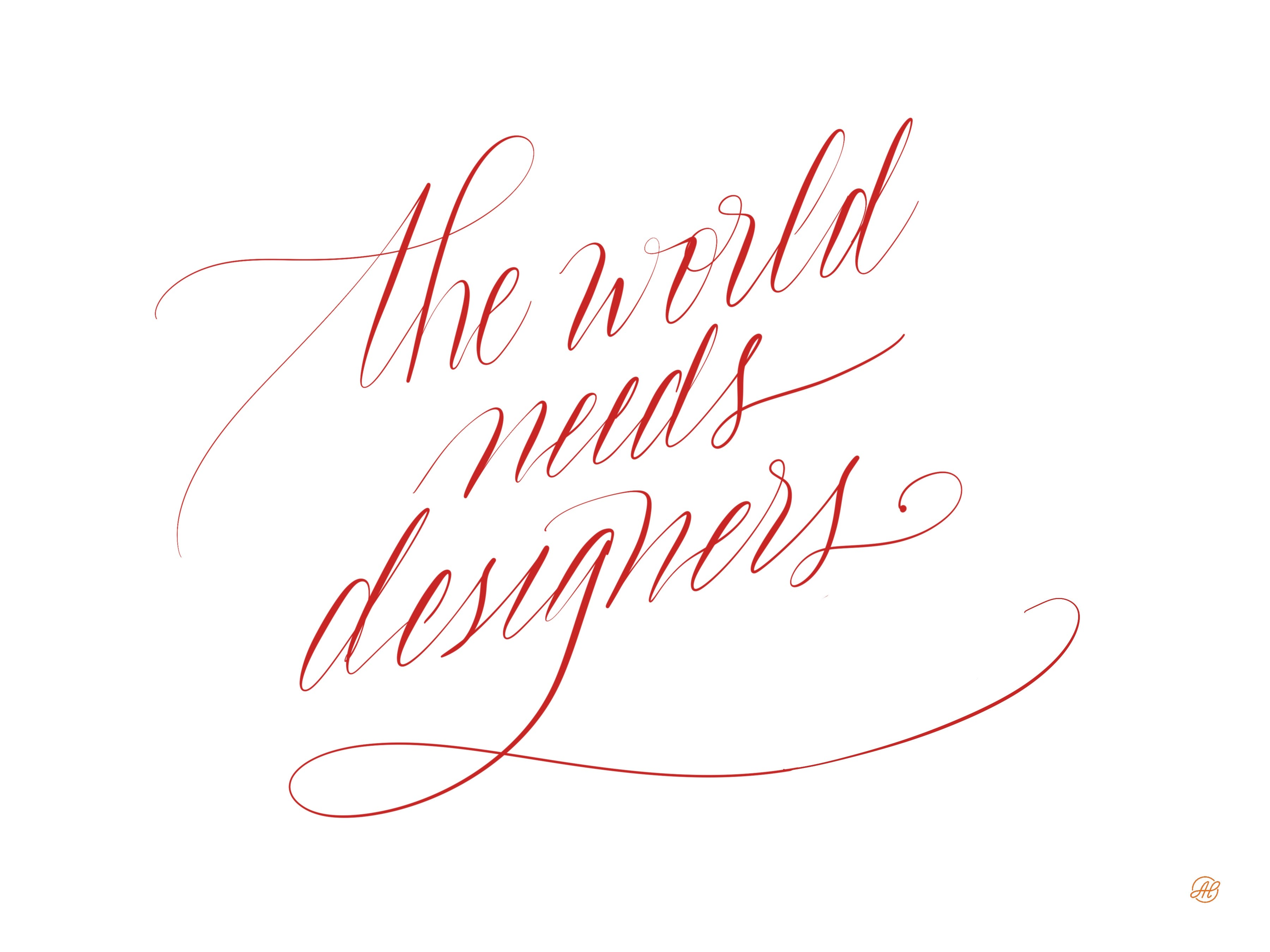
I did enjoy participating in the study a lot. So much that I signed up for others. But, I don’t get why not consult or hire a designer. In response I created this lettering piece below. I believe the world needs designers desperately. They just don’t know how much.
Until next week.
Love,
Alma