


Letters in conversation
An essay…


While I was in Atlanta for the SECAC conference, I visited the Museum of Design Atlanta (MoDA). They are showing an exhibition titled CHARACTERS: Type in Action. The show examines the relationship between typography, politics, and social activism. The exhibit is the collaboration between Tré Seals, designer and founder of the type foundry Vocal Type, Civilization, a design studio committed to enrich political and social causes for grassroots organizations, and professor and chair of the Department of Art and Design at Tennessee State University, Kaleena Sales.
The exhibition is both gorgeous as well as it is captivating and thought provoking. Seals designed typefaces to reflect the spirit of each political character, movement, or social cause selected for the show. Each typeface is carefully designed and crafted accordingly. For instance, the typeface designed to accompany the words of Jimi Hendrix was designed to reflect bell bottom pants he used to wear. The typeface VTC Colin Regular takes its design inspiration from Colin Kaepernick’s number seven at the NFL. The As, E, F, L, and Vs. They all slant like the number 7.
I was mesmerized with the show. It is a relatively small space but believe me, it was well organized and thoughtfully designed.


Above you can see The VTC Harriet is inspired by the symbols used by slaves escaping to freedom who would leave symbols as messages for others.


The room had banners printed on both sides showcasing the typefaces displayed on the walls. The show conveys deep emotional connotations.
The timing of the show was perfect. My students in both Introduction to Graphic Design and the Lettering class were working on typography posters and lettering quotes respectively. The typefaces and letters in the show left me wondering and thinking about the relationship between the printed or written letter and meaning and intent. Typography is after all, language made visual intended to be read and intellectually understood. Sometimes I wonder if it matters? Do non designers stop to consider the form, the lines, the details of the typefaces?
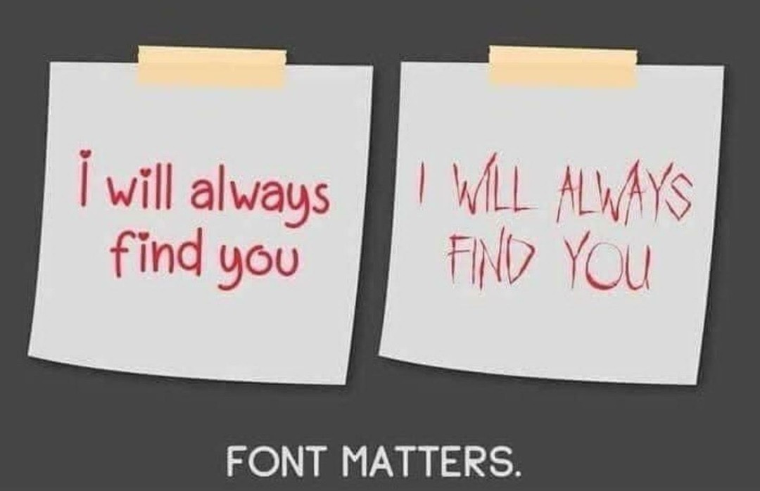
Internet memes are well known to us. A specific one that we have probably seen is the famous one “I will always find you” set in a very delicate and classical typeface versus a bloody dripping one next to it. One looks like a love letter and the other looks like a note from a stalker. This is a humorous example that proves a point. We all notice and when we see this example, and we can all agree that the typeface choices matter.
What happens when it is less obvious? Let’s for example consider a brochure or a program for a performance. On Friday night we attended a performance in which my daughter was signing. The Department of Music at the University of South Alabama has several performances throughout the year. These productions are amazingly well done, conducted, and organized. I have not been disappointed. The caliber of the students work and the professor is impressive. That said, their printed programs tell another story.
When you are a designer, and on top of that a type geek, letterer, and calligrapher, turning off your designer eyes is virtually impossible. When I was handed the program I could not help to gasp.
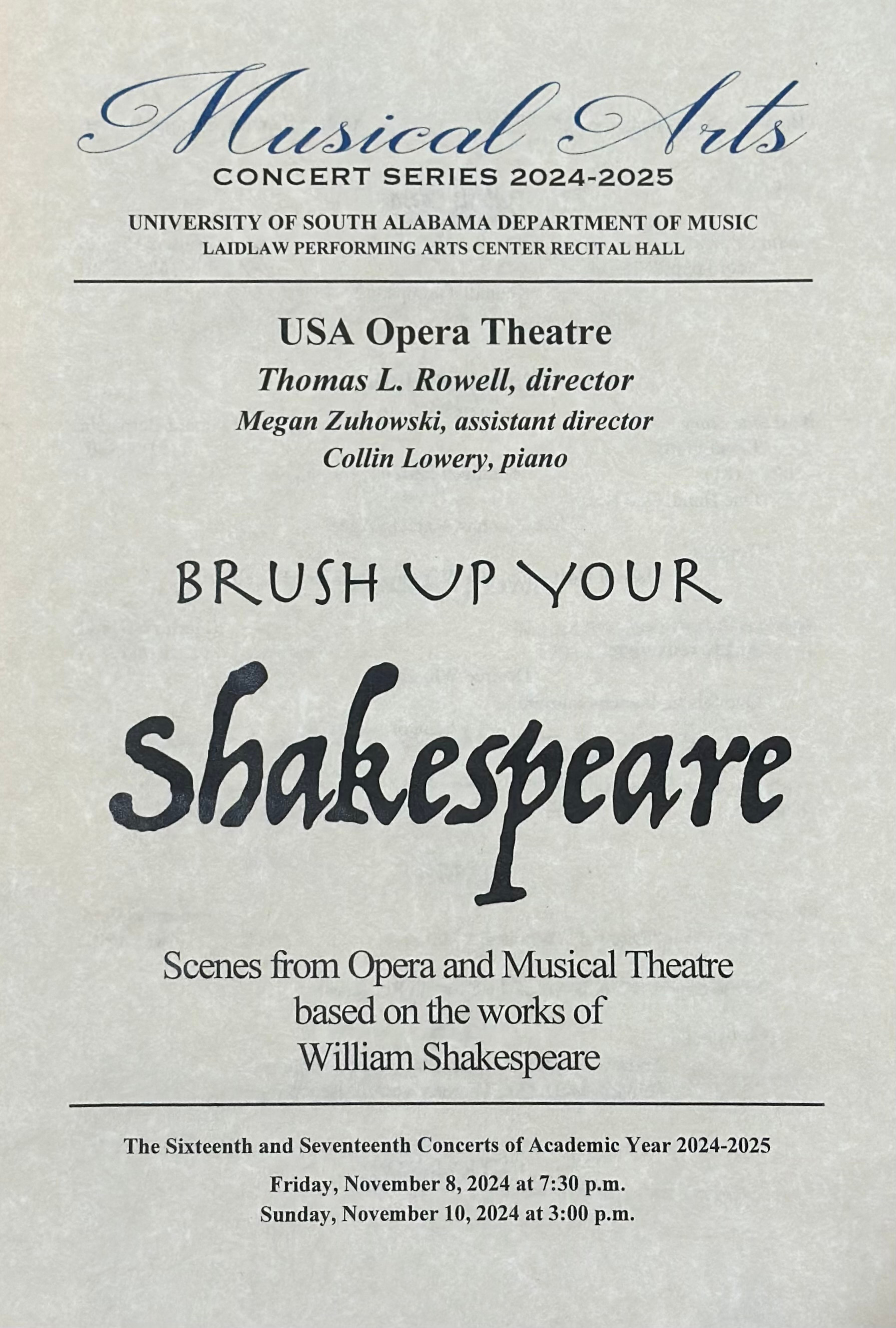
I understand that as a designer, this is glaringly obvious to me. Do non designers notice too? On something like in the picture above, are we designers alone in noticing? By my count and I am not being very incisive, there are about six typefaces on this program.
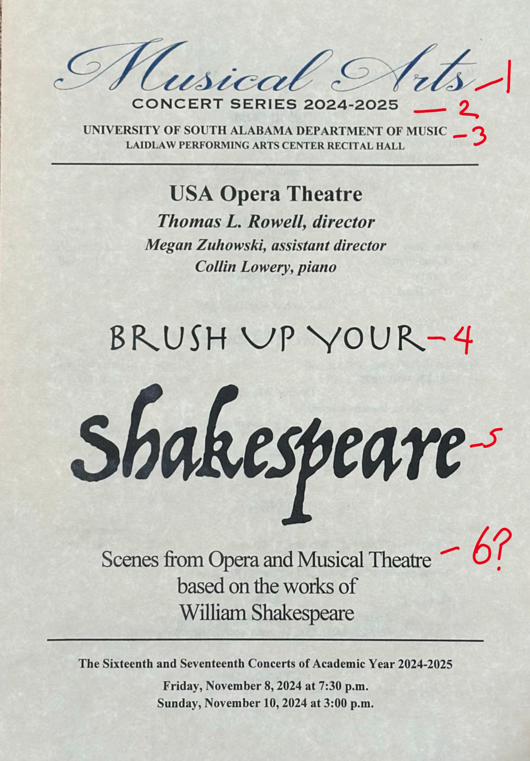
It is not a terribly designed program. The symmetrical layout helps since we read top to bottom. But, do we really need six typefaces? My first gasp was not even at the script typeface in which the name “Shakespeare” is set. It was the one above it: “Brush Up Your”. A cross between Papyrus and maybe Trajan? Two different Us? The kerning is well, unfortunate.
The letters for a typeface are designed to belong to a system and therefore need to share similarities. Along with that, typefaces can be designed to be effectively functional that they become invisible to the reader. While others, like the two aforementioned in “Shakespeare” and “Brush Up Your”, are designed to stand out and to even be disruptive.
The letters on a typeface usually start with a sketch. Designers who know how to draw letters often play with nuances and quirkiness flirting with their functionality. Or even flirt more with the expressive qualities and for the sake of a concept, may forego functionality all together.
Sometimes foregoing functionality in typography and lettering proves to be an unthinkable challenge for us designers. In the current lettering class, the students completed a project that forced them to think beyond the function of the letters. There was groaning, walking out of the class, push back, tears, and well, misconceptions came to the table for discussion.
A great number of them pushed and conquered the difficulties they faced. They all explored different aspects. “How to use the watercolor expressively? Is script lettering the only way? Can I do collage? What if I threw wine at the paper? What if I burn the paper? What if I rip the paper? What if I shot the paper with a gun at the range?” The list went on. But it was satisfying to see their process even when it made them feel frustrated.
There was one student in particular, Sophia Hayden, for whom the project was particularly difficult. She gave me permission to share her experience on this post. Sophia is a stellar designer. Her dedication to the process of a project is exemplary. When it came to this project, this free exploration of the relationship between meaning and visual expression caught her by surprise I think. I pushed her. She almost gave up. I actually think she gave up and her boyfriend helped her explore what she was really feeling. She brought along everything to critique and it was like taking a journey with her.


Finally, though her last piece was not visually loud, it was exactly like she is. This soft person who likes perfection and yet, while fighting against the boundaries, she could have very well whispered: “Burn out.” To all of us in class, that was it. That was the statement. That was the piece.
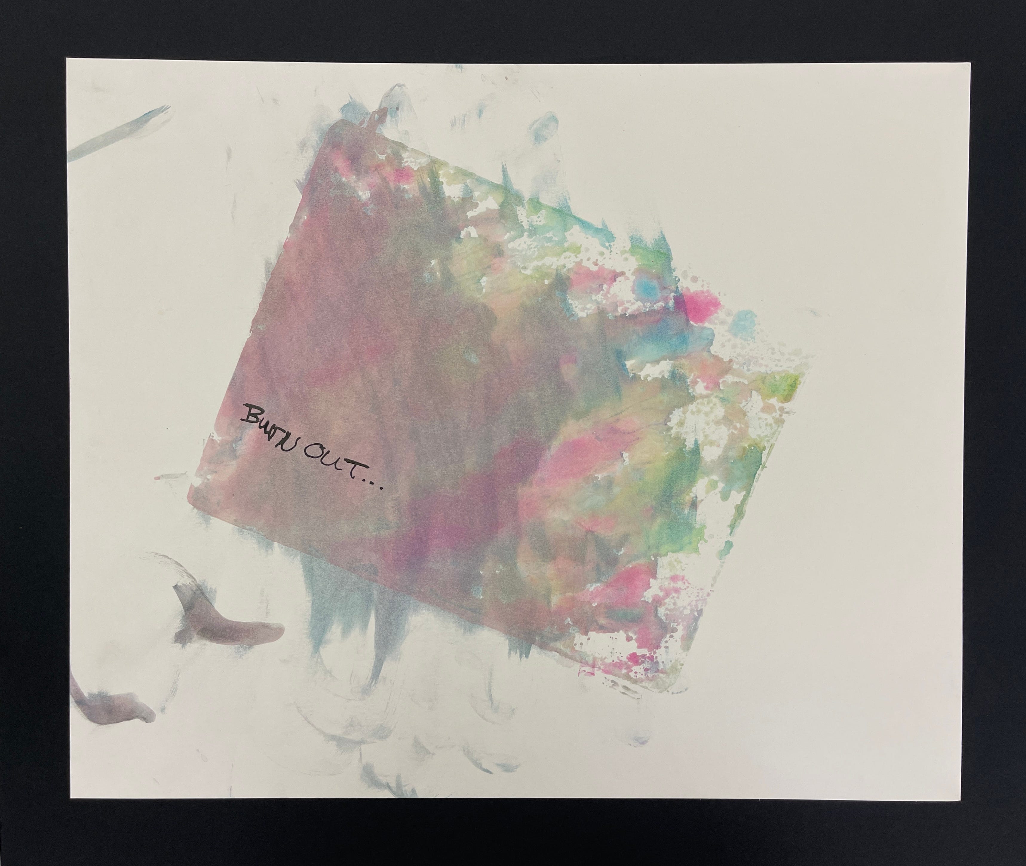
The nicely defined edges, the fight to get out, the turmoil inside, and the simple words became the piece that summarized her entire process.
Expression and functionality in lettering, calligraphy, and typography need not be exclusive to each other. The typefaces designed for the show CHARACTERS: Type in Action are both functional and expressive. Nonetheless after gaining an understanding of the medium, it is crucial to push its boundaries, to let go, and simply let things happen. Some things in our soul, our minds, and our being can only be expressed beyond functionality.
Love,
Alma