
Flow…
An essay…

The title probably makes you think about the state of flow one can experience in a creative session. However, this essay is about typography. Specifically the typography in a show titled Will Trent.
One of the lectures I gave to my Art Appreciation class was titled Movement. I provided them with a general overview of how movement has been represented in several art and design areas focusing on two types of representation: move as data and movement as image.
Movement as data can be appreciated in records of dance notation. Much like music notation, dance notation aims to capture movement on the page to be read. Ann Hutchinson, who was the expert in dance notation, has written several books on the subject. One of the fascinating things about dance notation is that professionals from a variety of backgrounds have been interested in shall we say, “freezing” movement on the page. Below is an example.
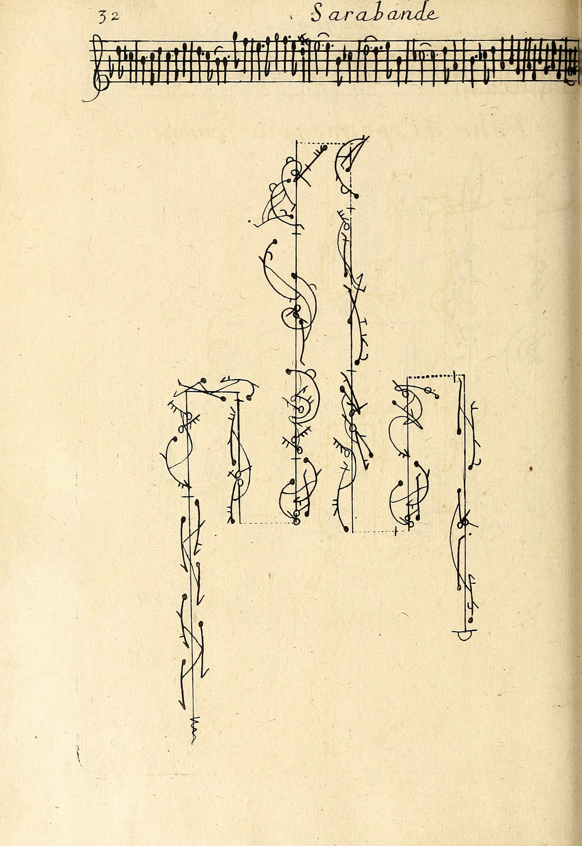
Raoul-Auger Feuillet, 1701.
When I started to address movement as image, we discussed, one of the first stop motion films, Humorous Phases of Funny Faces from 1906 by J. Stuart Blackton.
We also discussed the famous crawl scene in Star Wars, 1977, and where it came from which was the movie from Cecil DeMille, Union Pacific from 1930. We also watched a little bit of my favorite opening credits in a movie. That is Bicentennial Man, 1999.“Conceptualized by illustrators Carlos Huante and Constantine Sekeris and built by special effects wizard Steve Johnson and his crew at XFX,”
If I tell you that I had more fun preparing this lecture than the students, I am not sure you will believe me. I love research and putting together these lectures was fascinating to me. When we were about two weeks from the end of the semester, I asked the class what concepts they wanted to either revisit or discuss to end the semester. In that discussion, one of my students recalled the lecture about movement and the typographic examples I showed. She then told us of the show Will Trent and about the letters. She was so captivated about the way the letters were used in the show, she wanted me to know and highly recommended it.
Naturally, I started watching it. And yes, the show’s opening credits do not disappoint. There is a seamless integration of type and image in the show. But what is more remarkable is that the typography is always different on the opening credits. I did some research and found out that the designer is Alli Grimes. I tried finding out a website or an Instagram account but I was not sure if the Instagram account I found was hers. I am so impressed with the flow of type and image that I wanted to share it with you.
So, apologizing to the copyright and intellectual property rights authorities I took screenshots of the particular scene. Please dear authorities, I am not sharing this to make money or to steal any ideas. I am sharing this because it is so good it deserves the praise. Below you will find all the screenshots of the episodes so far and how the type changes on each. I find it wonderful.


The show itself is a bit of a mix between funny moments and the type of interactions in the life of Will Trent. Will is a GBI agent (Georgia Bureau of Investigation), survived foster homes in spite of abuses and neglect, and is dyslexic so he did not learn to read well. To cope, he carries a small recorder to dictate his notes on the tape. All of that is interesting of course. But my jam is the typography in it. I even found that there is a Reddit thread just to discuss it. I am surprised the show has not gotten more traction among designers, that I know of.
If you don’t want to watch the show, just wait until the opening credits and move on. It is THAT worth it.
PS. My annual Mother Day cards will be very late this year. If you are in my list of friends who get one, please wait a bit longer. Things have been tight over here but they are getting to you.
Love,
Alma