

And what was that proposal?
An answer in form of an essay


I never told you what my doctoral thesis proposal was. Perhaps you are wondering? Or perhaps not? It occurred to me that it would be good to share. If you are not interested, feel free to stop here. But if you are like me and curiosity drives you, keep on reading!
Let me start from the beginning…
My cultural and family background involves music and dance. My grandfather was a radio show producer. He gave me a classic guitar at the age of 6 or 7. The guitar was custom made for me by his friend who was a musician. His sister was a performer who had her own band called “Mary and the Caribbean devils.”
I grew up surrounded with music and dancing. But, as it often happens with things, I drifted away from it for a diverse number of reasons. Fast forward to the death of my grandfather, I felt very saddened. One way to honor his memory was to become a ballroom dancer. That and I was also in need of one credit hour when a flyer announcing a ballroom class appeared.
I practiced ballroom dancing about three times a week with my friend Jeremy. Not sure why but everyone thought we were siblings. We enjoyed it. I was about to go to graduate school and was taking several design classes to better prepare myself. The more design classes I took, the more I understood typography, and the more I understood typography, the more I saw the overlap between dance and design principles. For which reason, when I entered graduate school, I did not have to search for my topic. The topic found me. Whatever the project would turn out to be, it had to find the convergence between dance and typography.
A visit to the MOMA on January 3rd, 2000 gave me clarity. The show was titled Modern Starts. In it, there was a painting by Theo van Doesburg titled Rhythm of a Russian Dance. See below.
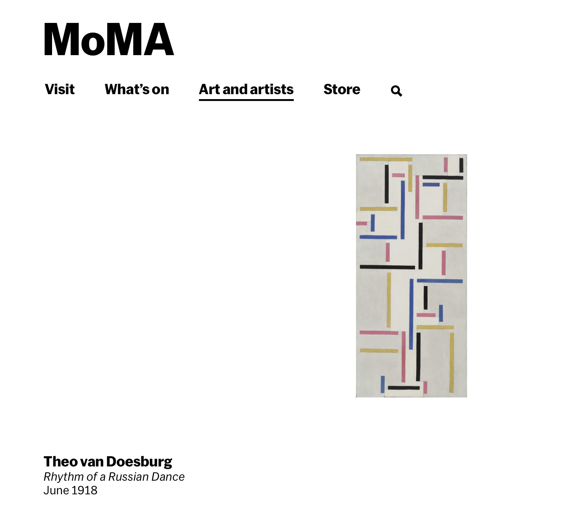
This painting forever changed my approach to typography. What hit me deeper was that even before I saw the title of the painting on the wall, I knew it was a dancer. I could see it right away. My immediate thought was what if I did the same? What if I took photos of people dancing, abstracted them to lines, and the line structures became a grid? I had found my project or rather my project found me.
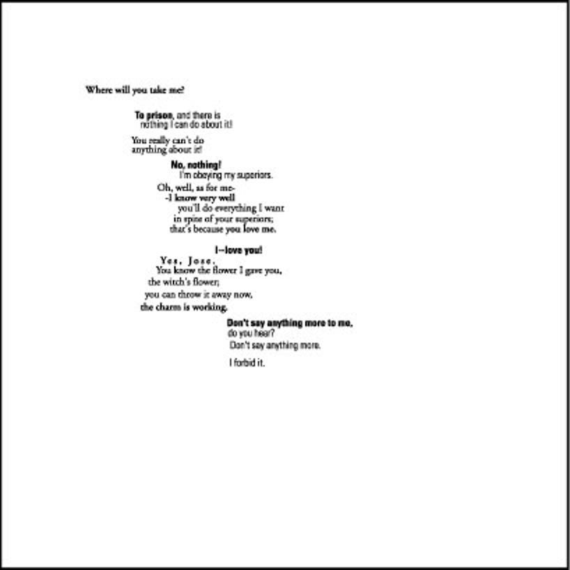
Movement became an essential part of my research. That is, movement as data and movement as image. Movement as data has been considered in the area of dance in the form of dance notation. Dance notation is a system of recording dances similar to music notation in the sense that it is a symbolic graphic system. The most known is Labanotation. It is still used today. See image below.

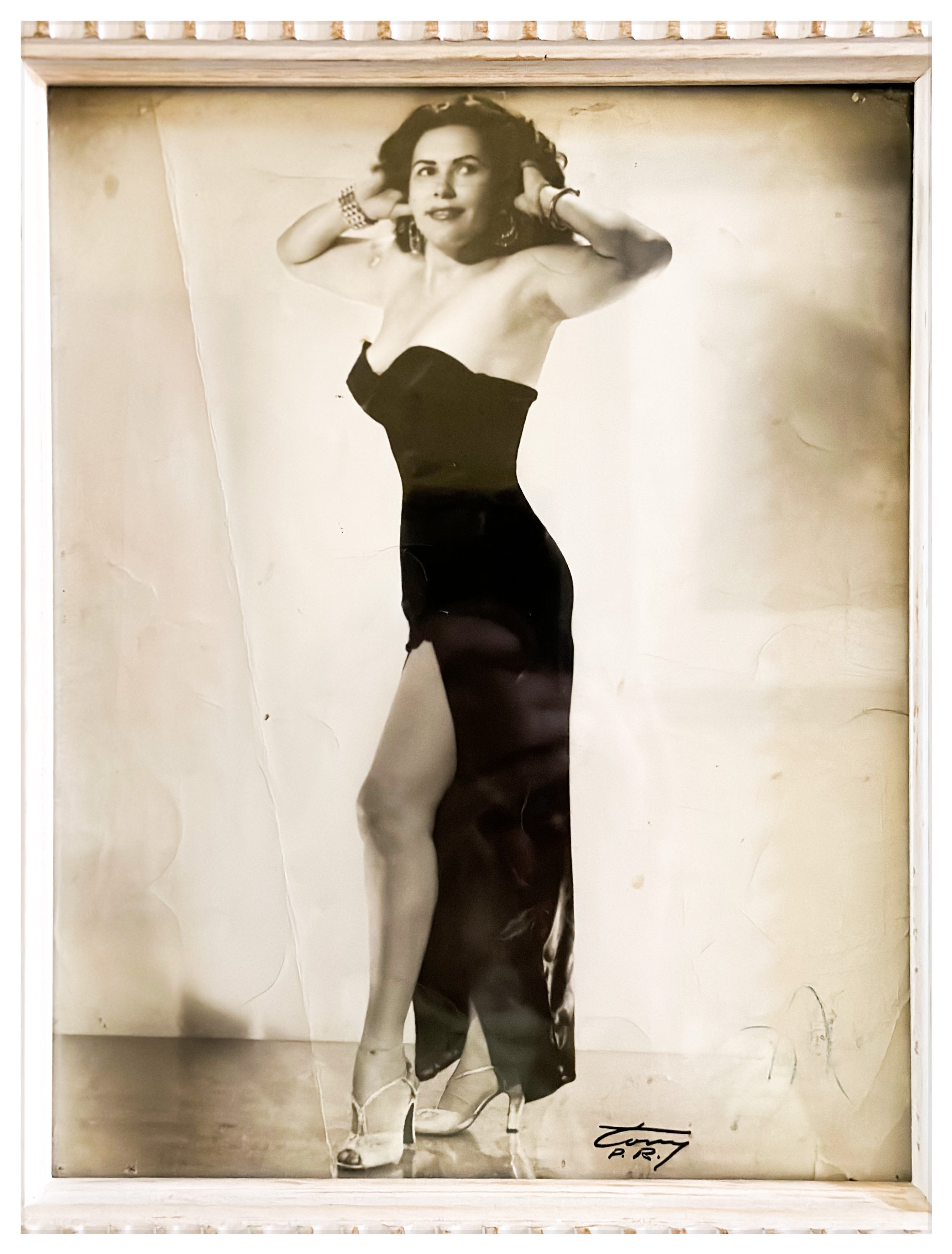
Movement as image has been considered since the beginning of time. Early civilizations painted movement, often in caves, as a way to both record their presence and activities and also to communicate with others. The research to find precedents to do what I wanted to do—abstract the body in motion to become a grid for layout, did not produce exact examples. Thus, my search led me to build a methodology and system to design compositions in which the grid came from the body movement. (See example below of a composition using a grid that came from two dancers). Another time I will explain the choice of text, format, and typefaces. For now, what I am focusing on is the layout of the composition.
What I really wanted to do however, was a live projection of these grids (abstracted lines based on the figures) to animate the typography following cues from the bodies in motion. My professors thought that was the next step and much more deeper than required for the MFA.
Fast forward to this summer. My proposal of study for the PhD in Typography was exactly that: to inform the animation of the typographic content based on how dancers move to said content. I have been haunted by this question ever since completing the MFA: will it make a difference if the animation of typography was based on dancers’ movement and how?
I believe that dance as a discipline has been relegated from the arts. We see it as something distant. In a society that is increasingly becoming more and more sedentary, movement has become a strange concept, let alone the practice of it. However, asserting our bodies in space is vital to our self confidence. Developing large and fine motor skills provide much needed connection between our minds and our bodies. Our minds need us to move, to release, to renew, and to learn. For me as a designer, dance has changed how I see type on paper or on the monitor. I see type as dancers on a stage.
Using a dancer to inform the animation of typography is for me the next logical step. I don’t know if it would make a huge difference from what we commonly see in animated typographic pieces—also known as kinetic typography. Kinetic typography has been around ever since film. The opening and closing credits in movies are a good example. Notable examples that come to mind is Catch Me If You Can and Bicentennial Man.
It was however, the opening credits on the Star Wars movie released in 1977 that made the biggest impact on me. I was a teen when I saw it and the only thing I really remember is the typography receding in the space— the opening crawl. It was memorable. The technological limitations make it even more memorable. But, to me, the most remarkable characteristic is that the crawl mimics a spaceship navigating into the space. The type moves accordingly.
Since 1977, much more has happened. Seven years later, Apple released their first Macintosh and technology has moved fast. As a result, it has changed the way we design. Kinetic typography is now a staple. It remains my question to find out how and if the animation of typography change if the source of the movement was an actual dancer. Moreover, what if the content was in another language? Would the movement be enough to convey its meaning?
That is it, my friends. In a form of a short essay what I had proposed for the Ph.D. program.
Much love,
Alma