


When your favorite nieces have babies, they might ask you, their aunt designer to do things for them. If that auntie has a soft spot for their little voices saying “titi Alma, could you do x or y…” said titi Alma’s heart melts almost immediately. For reasons that are deeply personal, our hearts are intertwined in a deep, deep bond.
My nieces had baby girls weeks from each other two years ago. And they are now expecting again due in the summer. One of them asked me to design an artwork with letters because her daughter was learning them.
Suffice it to say that she had me at “letters”. The question was what to do exactly: a poster, a set of cards, a book? If a book, what size, what color or colors, and how? Then, the agonizing over the style of the letters ensued. I started pinning on a board examples of letters that looked like designs for children and another board to pin children’s books. Still, I felt lost for a couple of weeks.
I started to research children books, went to the library to get books, and started to read a bit about children, especially about two year olds. Then, I remembered some of the geometry and reading lessons from Wheaton Montessori School when we lived in Chicago. There are many similarities between design education and the Montessori method, but that is for another post. A particular aspect from my kids days at Montessori has always stuck with me. I remember my son tracing shapes with his index finger. He’d do this with words and objects he’d see. That memory helped me decide what to do.
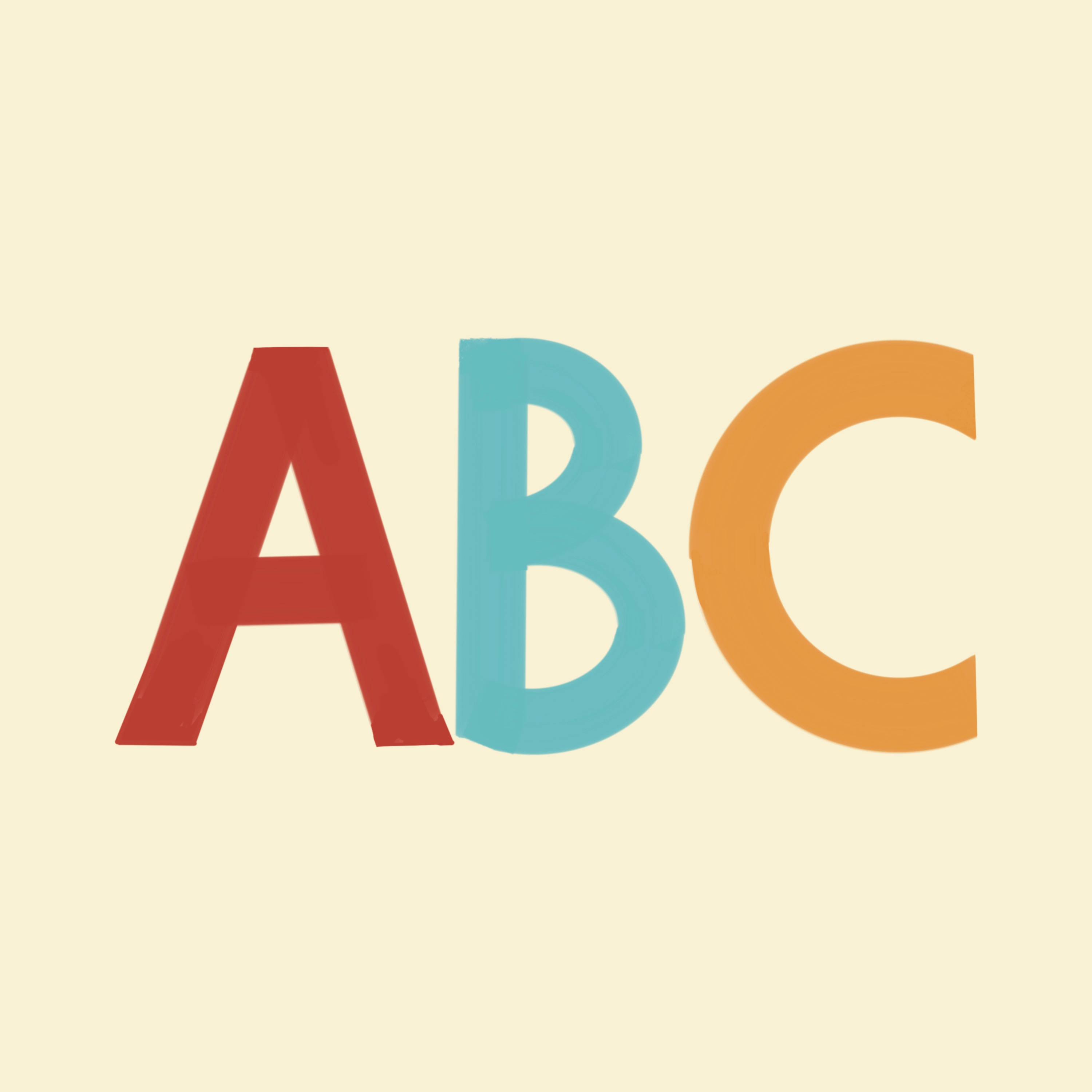
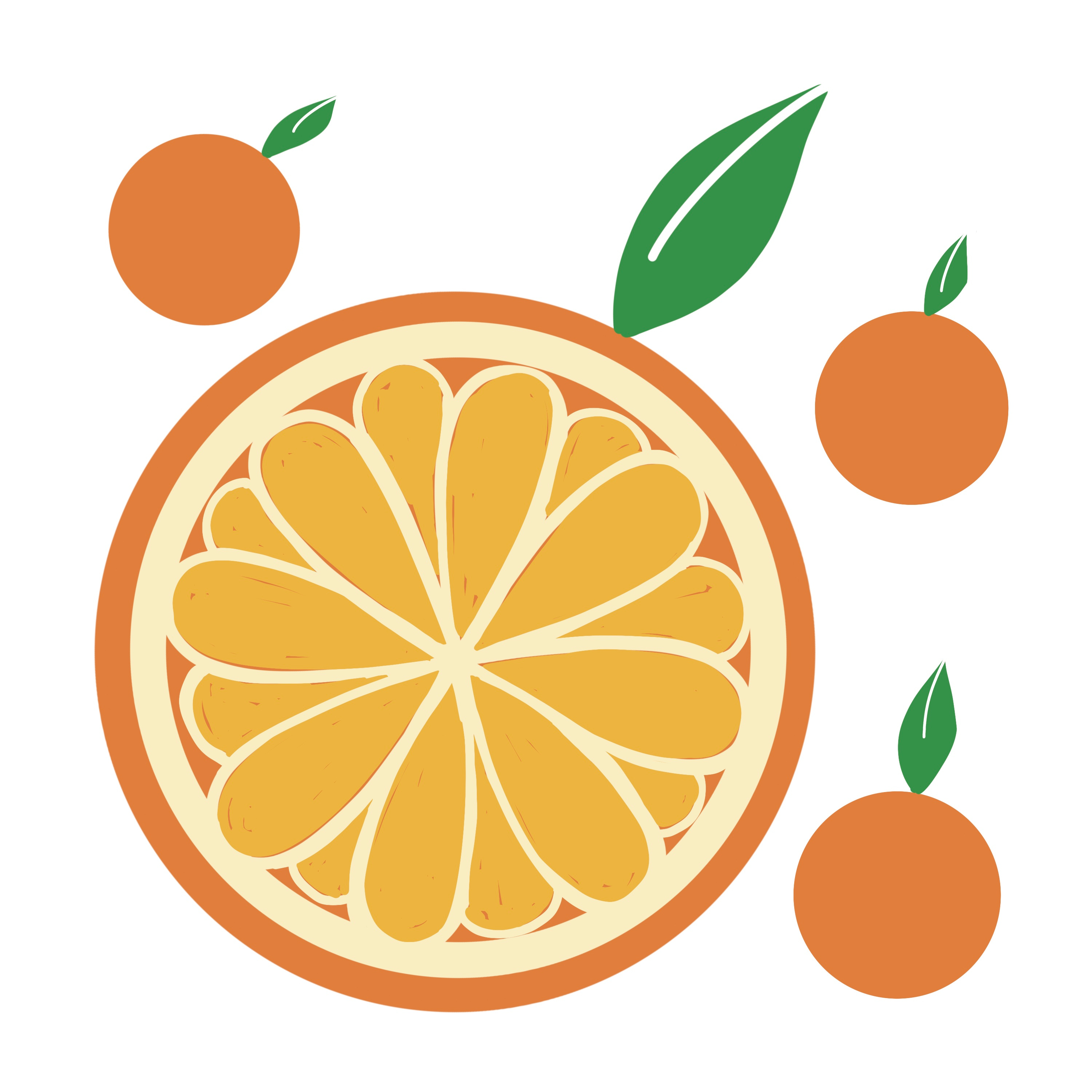
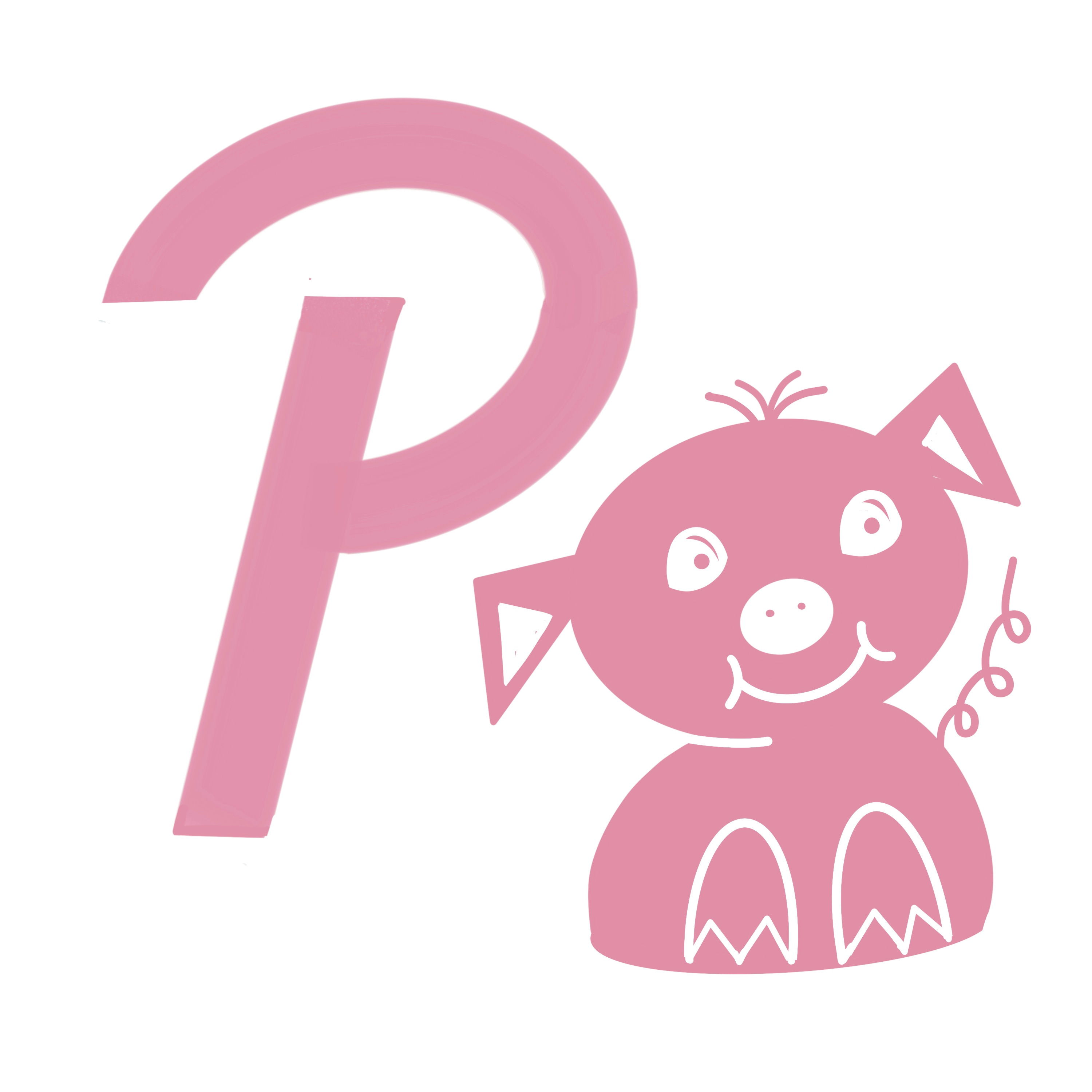
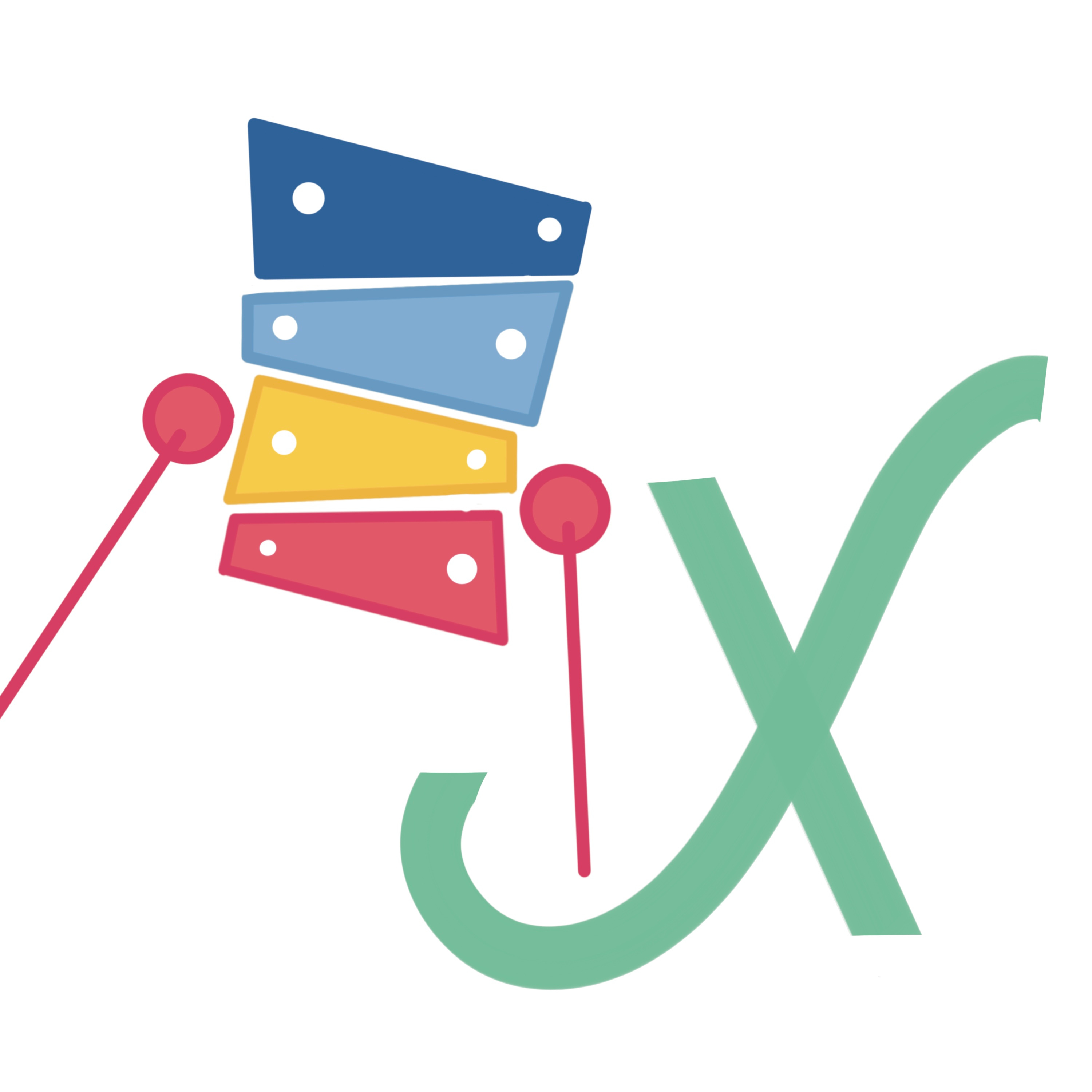
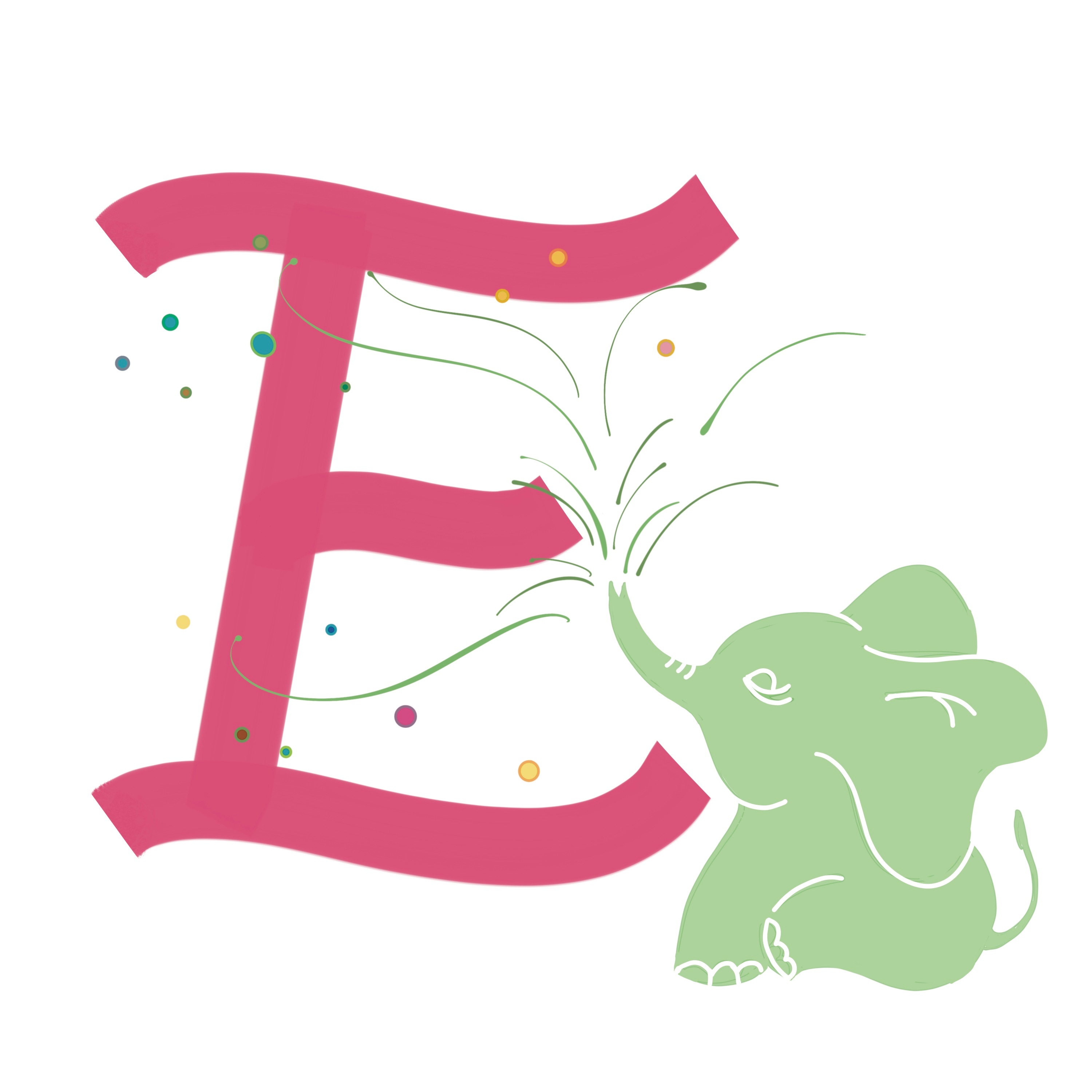
The letters needed to be thick enough for a two year old to trace with their finger. Not unlike some of the letters I had done before in my daily practice. I thought I would add a simple graphic of an object—food or otherwise— that started with that letter. I also wanted the book to be small to fit in the hands of a two year old. Thankfully, Blurb offered a 5” x 5” book in softcover at a very reasonable price. Then, I started to work.
Looking back, I realize that I could have been more consistent in the type of letters I was creating. Same with the style in which I drew the objects. I also realized that doing this for a child was more intimidating than designing for an adult. There are a plethora of questions floating. For instance, is this stroke thick enough, should the O be more like an oval or a circle, how much information is too much or too little? At the end, I decided to go through with it all and make edits later on. One of my niece’s birthday is passed and the other one is coming up. Deadlines always work, don’t they?
The book is uploaded to Blurb. It is not listed on their bookstore yet. If you are interested in getting one, here is the link: https://www.blurb.com/bookstore/invited/10237019/a41c0efd0254aa9f6a4c5fda35cb4312c7c34429. Nonetheless, I have posted some photos below:
It will be so fun for them to use your work to learn the alphabet. Thanks for sharing!