

The design of information

I think this essay will be a boring one but I will write it anyway. I find myself thinking about our latest class project and why I assigned it. It is not an exciting reason. It has to do with medication labels.
Before we started our current project, I had been thinking about teaching it for a while. It was a toss between a designing an infographic or approaching infographics as one aspect of information design. I opted for the latter because it gave the class more options in terms of approaches their topic and its content. They could do an infographic if they desired, or a public awareness poster, or an instructive display of information.
My desire to discuss a project about the design of information came from my frustration with some of my medication’s paperwork. Every time I pick up a medicine, even if it is a refill, I get these four or five pages of the same information as before. And worse, some of these pages contain private and sensitive information. It bothers me. The primary label is repeated at the top of every page and on the medication bottle. I found the one below doing a Google search. Yes, it is from 2011 but I also searched the address and it is a real one. Which at the moment is under a flood warning by the way. See, how easy that was? I wonder if anyone else feels the same way?

Yes, I understand the need to make sure the consumer is informed to the point of suffocation so that the pharmacist and pharmacy are not liable. But, considering that our lives are increasingly online, would it not make more sense to email the information or have a system where the consumer logs in to confirm they read and understand what they are receiving? I know, I am probably dismissing human nature here.
There is a delicate balance between receiving too much content and receiving too little to make good decisions. The need to identify clearly what choice to make can be mundane or it can be a choice between life or death. For instance, taking the right meds at the right time as indicated in the bottle or taking the right or left turn because a sign is not clearly displaying the destination can be potentially tragic. Properly and quickly reading the dashboard symbols in a car while driving is obviously crucial. Not to mention the irritation we universally feel when we are trying to put together a piece of furniture from IKEA, whose instructions are notorious for their lack of clarity.
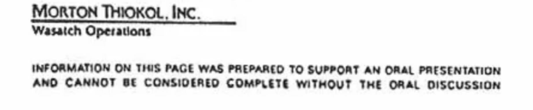
The lack of clarity is a design problem. And it is one that I must emphasize is not solved by simply knowing the appropriate software or giving the instructions to ChatGPT. Edward Tufte, who is an emeritus professor at Yale University, discusses on his book Visual Explanations what he believes was the reason for the explosion of the Challenger in 1986. He argues that the graphic displays of the data regarding the erosion of the O ring in cold temperatures were poorly designed and ineffective to clearly see the correlations between the factors which would cause the explosion. I showed the graphics to my students and they were lost. It did not take explanation on my part for them to understand that there was not clarity on such diagrams. By the way, you can find anything on this topic and more graphics on NASA.gov. I have added the diagrams below. They were part of our discussion about properly understanding visual design principles.

As bad as these diagrams are, there was a red flag spelled out that I am not sure it was discussed. See below.
See the problem? Any design that needs the designer or an oral presentation to be complete, has failed in its purpose. Design needs to stand alone. This is the reason why we can navigate airports. A system of symbols has been adopted to communicate regardless of language, ethnicity, and culture. Can you imagine how relieved I felt the day I stepped out of the airplane in Greece when I saw the symbol for suitcase? I am almost never lost because I am bilingual but though the Greek alphabet is similar, the sounds of the letters are very different. For the first time I was fearful of becoming an international diplomatic nightmare. I mean, not really, I am not that important.
We have two extremes: labels with overly repeated content that can potentially be too revealing and not having enough clarity to the point of making decisions with fatal consequences. Let me be clear, I am not saying that the cause of the Challenger disaster was directly related to the diagrams. Tufte has won many critics for this position. I am saying that it was one of the factors.
The tension between what we design and how it is received feels at times like a juggling act. As a society we experience the most information overload of any previous generation. Harris Andrea, author of the article The Human Brain is Loaded Daily with 34 GB of Information cites American psychiatrist Edward Hallowell saying,
“never in human history, our brains had to work so much information as today. We have now a generation of people who spend many hours in front of a computer monitor or a cell phone and who are so busy in processing the information received from all directions, so they lose the ability to think and feel. Most of this information is superficial. People are sacrificing the depth and feeling and cut off from other people.”
Of course, back in the Middle Ages when the printing press was invented, there was concern too about how much information we could handle. Therein lies the delicate and fragile line a designer needs to walk. Asking ourselves “how much is too much, how little is too little, how are the visuals supporting or detracting from the purpose of this diagram, should be a constant monologue in the designer’s mind.
There are so many things to be learned as designers in the making. From visual design principles, software, typographic nuances, hierarchy, balance, color harmonies, and so on. But our business is not a business of simply making pretty things. It is the business of having such empathy for the intended audience that we can balance successfully what they need to know when they need to know it in order to make productive and healthy decisions. Adapting content to age groups, simplifying or embellishing said content based on context, establishing visual parameters to make sure the content is not dismissed when needed, are all part of what is to design.
In the meantime, yes, Walgreens if you can please check my history and realize that repeat medications might not need the same paperwork over and over and with that, can you not publish my address on every single page and on the bottle too?
Love,
Alma